QUELL
Quell is a geometric typeface with a twist.
Inspired by round and constructed forms paired with
the dynamic energy of a slanted contrast angle.
Expressive & delicate voice
in CONTRAST styles
With dynamic stroke contrast text has energetic appearance and a lively stance.
Confident & neutral tone
in LINEAR styles
No stroke contrast imparts even appearance, formal expression and timeless repose.
Quell is available in the following styles
and as Variable Font with weight and contrast axes.
- Foobar
- Foobar
- Foobar
- Foobar
- Foobar
- Foobar
- Foobar
- Foobar
- Foobar
- Foobar
- Foobar
- Foobar
- Foobar
- Foobar
- Foobar
- Foobar
- Foobar
- Foobar
- Foobar
- Foobar
- Foobar
- Foobar
- Foobar
- Foobar
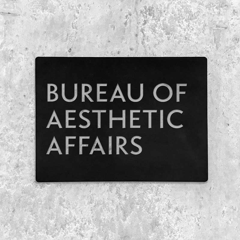
The Linear styles have strong gusto, but still convey a subtle human and friendly touch.
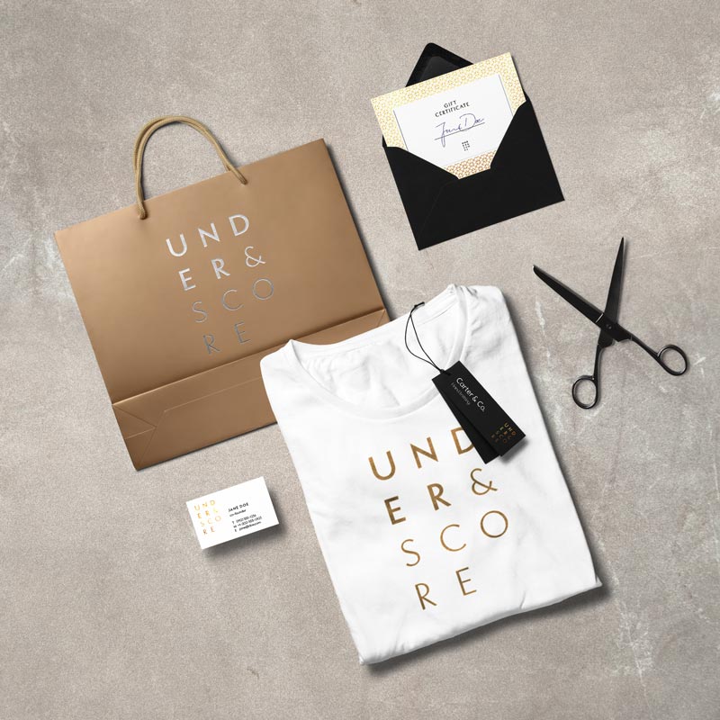
Fashionable, versatile and a tad of classic elegance — Quell convices with range and a friendly voice.
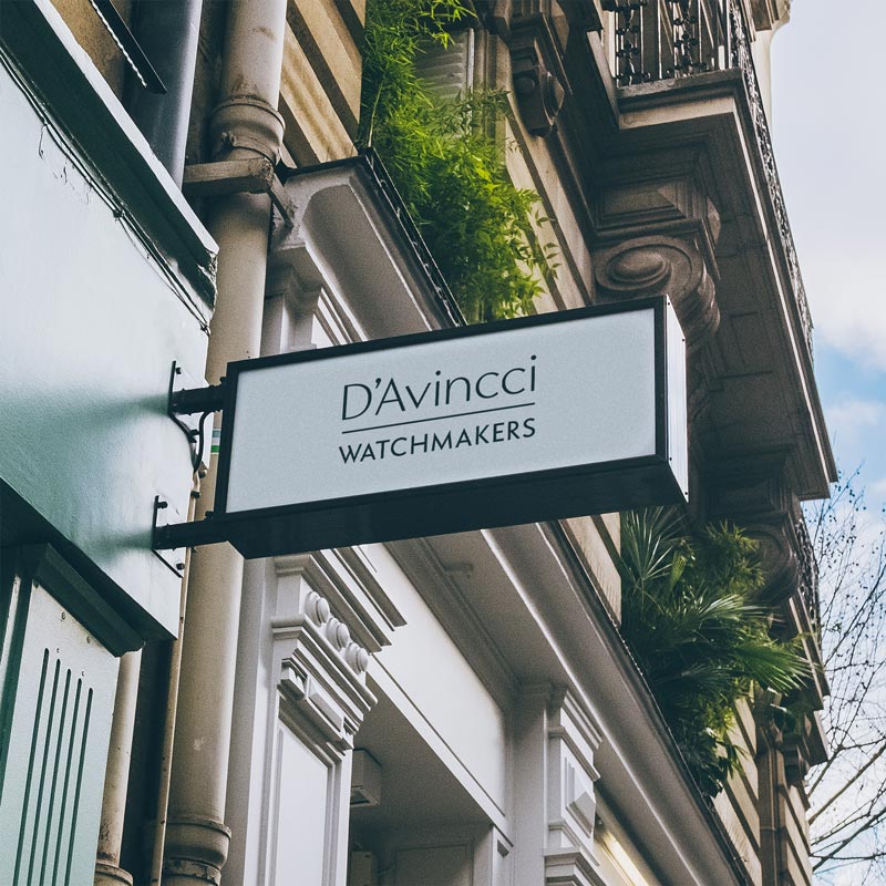
The classic proportions of Quell’s capitals convey an instantly stylish flavor for use in brand fonts and signange.
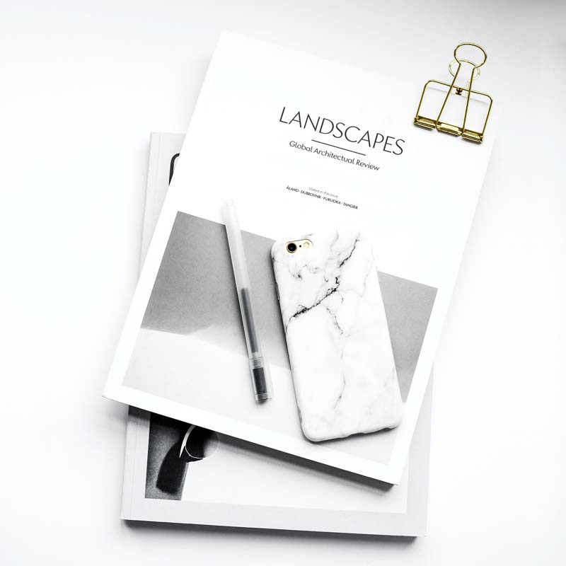
The thin and light styles of Quell, especially the Contrast variants, exert elegance and distinction.

Quell fonts have plenty of typographic goodies, such as this beautiful fleuron which comes in six weights and contrast as well as linear variants.
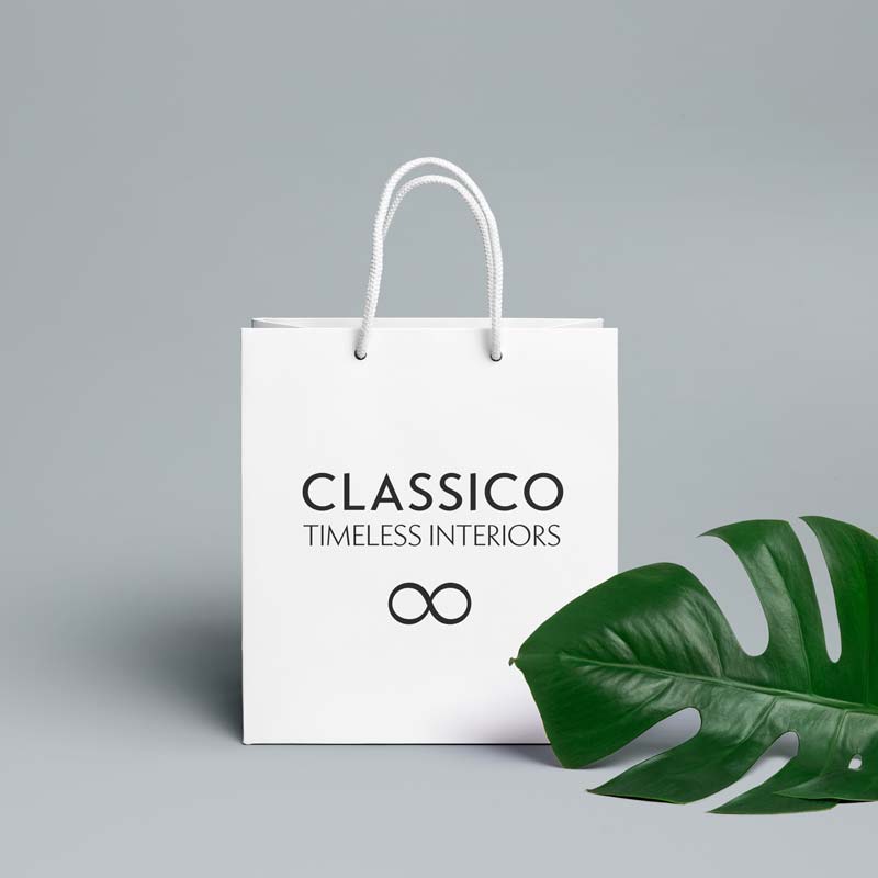
From editorial to packaging and signage - Quell has the range required for a flexible brand font.
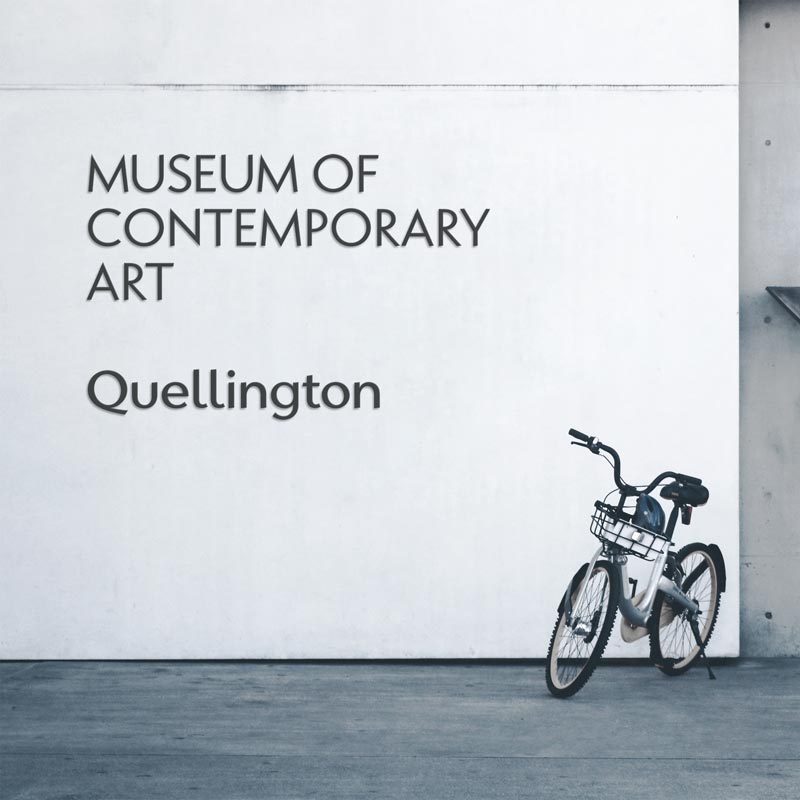
The classic geometric proportions of Quell's uppercase make give it a timeless flair in signage and wayfinding.
Try before you buy: Free demo fonts for trying Quell in your mock ups are available from underscoretype.com.
The origins of QUELL
Quell embodies a thought experiment: What does a geometric typeface look like with modulated stroke. Geometric typefaces, from prominent origins like Neuzeit, Futura and Erbar, feature strokes of even width.1 The visual cornerstone of such typefaces is a rational approach with dominating round features, stark angles and sharp lines. A variation of stroke width is a natural irregularity this genre has cast aside in favour of cool, calculated forms.
Recent years saw a formidable explosion of new and revived geometric typefaces, many of which infuse and enrich the genre with different tonalities. Quell is a novel attempt to bridge the gap between geometrically constructed shapes on the one hand, and modulated strokes and subtle calligraphic influence on the other hand. A prominent approach in modern typeface design is shaped by the understanding of writing tools and their effect on the marks they produce — which in turn fonts emulate and distill for typesetting. The visual tension in Quell stems from an underlying inner conflict between two tendencies: The perfectly round shapes are geometrically constructed, yet the contrast of stroke widths and oblique line terminations suggest calligraphic roots.
How this ambivalence affects the typographic impression is up to typographers using Quell — with a variable font2 the transitioning between modulated contrast and linear appearance offer unique typographic options. Linear appearance gives the text a solid and affirmative voice, whereas the modulated styles convey elegance, vibrance and a delicate tone. Quell shines when used to set display or short paragraph text.3
- Or more correctly speaking optically corrected, thus visually appearing even
- OpenType variable fonts are a very recent format extension allowing the use of arbitrary interpolation ranges in addition to more common weight or width scales
- Note: Quell is a display typeface by nature. Using it in text like done here for demonstration requires extra line and letter spacing. All in all, however, Quell really is more suitable to set text large and center.
Available as Variable Opentype font
Quell makes use of latest font technology which let's you seamlessly pick between weights and the amount of stroke contrast you envision for your project.
Hamburgerfonstiv
Instead of a continuous transition along the weight and contrast axis you will only see how those extremes look.
Move your cursor from side to side and top to bottom.
Variable fonts are available as two files for the entire font family, one for upright styles, and one for oblique styles.
Those fonts are included in the respective family packages as added bonus.
See packages including
Variable fonts
Batteries included
Language support
With over 500 glyphs Quell supports the vast majority of languages using a latin based script.
- Mųľŧìłĩñġűąĺ
- Paral·lel Vrijdag Woźniak
- «¿Que?» $€£₽¥₹₺₿
- Glyphs from common to obscure,
covering well over 200 languages
- Localized forms for many languages
- Punctuation support & currencies
to serve a wide range of applications
Typographic finesse
Quality typography needs more than letters and weights. Here are just some of the features and glyphs included in Quell fonts.
- †¶‽©℮
- ? or ? — a or a
- ☙Plain pretty❧
- Some glyphs you only miss when they are not included
- Choices beyond the standard,
see all in the specimen PDF
- Because sometimes the pursuit of beauty is enough of a cause in itself
Opentype features
Ligatures, number forms, smart substitutions are all included for you to make the most of typesetting with Quell fonts.
- Affiliate flyfisher
- H2O and x2
- 18/27 or 2/3
- Combining and non-colliding ligatures and alternates
- True scientific superiors and inferiors instead of ugly scaled numbers
- Arbitrary and precomposed fractions
- single weights
29.009.00 - all Contrast styles
149.0039.00 - all Linear styles
149.0039.00 - entire family
249.0069.00
Register at underscoretype.com and get free demo fonts for testing in your mock ups
Download a specimen sheet with more detailed information, text samples and glyph overview